The launch of Autostraddle’s print magazine issue #02 has been met with enthusiastic response from readers and critics alike. This ad-free, 220-page volume gathers a diverse roster of writers and artists whose work spans essays, fiction, visual art and longform criticism. Far from a simple merch extension, the edition functions as a curated physical document that aims to capture the pulse of contemporary queer culture while offering readers a tactile counterpoint to the daily flood of digital content. Notably, the publication details include the original posting timestamp: published 18/04/2026 14:00, which marks when the announcement and distribution details were shared.
What stands out in this issue is intention: every spread feels deliberately paced and designed. The editorial team prioritized voices that challenge, comfort, and provoke; each contribution was selected to sit within a broader conversation about identity, art and community. As a physical object, the magazine encourages slow reading and reflection, inviting the audience to engage with long-form pieces that often get abbreviated online. The absence of commercial interruptions means layout and sequencing become part of the storytelling, making the magazine not just a collection but an argument about the value of print in a digital age.
Curating talent and perspective
The lineup of contributors is a deliberate mix of emerging and established figures: poets who use compact forms to complicate memory, essayists mapping lived experience, and visual artists whose pages operate as standalone works. The editorial choices put writers and artists in conversation rather than isolation, weaving different modes into a coherent whole. Each piece is positioned to amplify other entries, creating thematic echoes across the 220-page run. Readers will find that the sequencing makes editorial arguments about inclusion and intersectionality, with an eye toward underrepresented narratives. In print, these juxtapositions gain permanence and a new kind of legibility that online browsing rarely affords.
What the contributors bring
Contributors bring distinct practices and risk-taking to the pages: some pieces experiment formally, others foreground memoir and reportage. The result is an expansive portrait of contemporary queer life that privileges nuance over headline-ready declarations. The presence of both visual and textual work means the magazine functions as a gallery and a reading room simultaneously, granting equal weight to image and argument. This deliberate balance is important because it asserts that representation can be both affective and analytical—an editorial principle that guides selection and layout. The publication’s design supports this aim by allowing each work space to breathe.
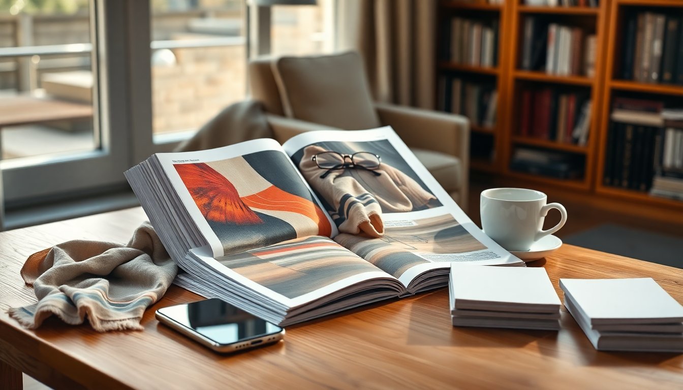
Design, format and reading experience
From cover to colophon, the physical choices are communicative: paper stock, typography and pagination all contribute to a reading rhythm. The magazine leverages design to create pauses and emphasis, using full-bleed spreads for visual pieces and denser type for analytical essays. These tactile decisions reinforce the magazine’s status as a craft object—an alternative to the ephemeral scroll. Because the edition is ad-free, the magazine is free to invest in the reader experience rather than third-party attention metrics. That editorial freedom manifests in longer pieces, experimental layouts and the decision to prioritize craft over clickability, which together make the issue feel considered and enduring.
Why this matters now
Producing a substantial physical magazine in an era dominated by online immediacy is an act of intentionality. The publication of issue #02 serves as both a cultural artifact and a statement about investing in durable, curated work. For communities that rely on shared spaces for dialogue, a tangible magazine circulates among readers in ways that reshape private consumption into shared cultural literacy. The project underscores a commitment to platform-independent storytelling, reminding readers that high-quality writing and art can thrive beyond algorithms. As a result, Autostraddle’s print edition functions as both a celebration of creative labor and a blueprint for sustaining meaningful cultural conversation.


